Ever since Lea Verou mentioned about the possibilities of CSS3 Gradients, I have been using them in various shapes and sizes as a replacement for background images. I recently worked on a project which uses a bunch of circles as a decorative background. gf3 suggested that the circles would look much better like bokeh. Today, I finally got down to creating them.
Result
Design of the Bokeh
I referred to some pictures of bokeh, and these were their defining characteristics:
- There should be groups of circles with same color (each circle outlined with the more opaque version of the fill). In each group, circles are close to each other.
- The color transition from one color group to the other can be accomplished with a very blurry second color group radial gradient overlaid on the first group.
- Each color group needs to have a very blurry large background circle to base the rest of the circles from.
- Each color group has 2 or more of smaller circles and one big blurry circle as a base.
- Colors used are almost transparent so that the background color shows through, and the colors mix well when they are overlaid.
Implementation
Here is how a single “tile” looks like:
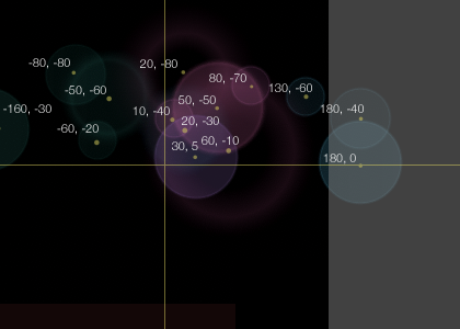
The black background is the size of the “tile”, set by background-size property (the grey area is where our circles spill over). In our demo it is 300px square. Each of these circles is a background image (all gradients are background images), and have a default background-size property set to the top left corner of the tile, which means, the center of each of the circle is at the intersection of the yellow lines in the image above.
Then, we use background-position to offset them into places we want.
By tweaking the background-position for each of the gradient images, we also move the center of each of the circle - shown in the image above relatively. Do note that what actually moves is the top left corner, but I find it easier to visualize the positioning of radial gradients in this manner.
By using background-repeat, we can repeat our bokeh across the screen! You can tweak the tile size so you can get some interesting effects.
Needless to say, this demo only works on Firefox 3.6+, Safari 4+, Chrome 10+ all of which support CSS3 radial gradients as it has been finalized in the spec (support is coming soon in Opera 11).
Update
Alexis has kindly provided an SVG that would work as well for browsers that do not support gradients! I have updated the demo to use Modernizr to detect for gradients, and serve the SVG version if the browser does not support it. Whee! Thanks Alexis!