If you are like me, you would have been (ab)using Google Web Fonts for your custom font needs. In which case, you most certainly would have tripped on this problem: Faux Font bolding.
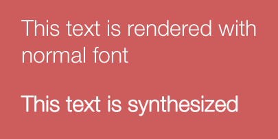
Most browsers synthesize the bold weights of fonts that do not posses a bold weight. For example, the font ‘Helvetica Neue Light’ does not have a bold version available. If you use font-weight: bold with that font, browsers will artificially create a bold weight and render it like this
The Problem
Now, this problem is exarcerbated when used with web fonts, especially the free open source fonts that are served from a service. Google Web Fonts, for example, serves slab fonts like so:
@font-face {
  font-family: 'Erica One';
  font-style: normal;
  font-weight: normal;
  src: local('Erica One'), local('EricaOne-Regular'), url(<font url>) format('woff');
}
What this code declares to a browser is: “Hey, this is the least weight available for this font called Erica One. So, if anyone wants a heavier weight, you need to synthesize it just like you would do it to local fonts.”
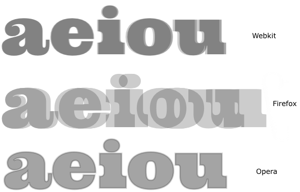
Now, the problem occurs if you only want to use this font for your headings. By default, browsers apply font-weight: bold to all headings. But the browsers need to obey the font-weight descriptor that is used in the @font-face rule above! This means, they will try to fake the bold weight of the already-heavy weight Erica One. Alas, the method used for synthetically generating the bold weight is not specced, so each browser does its own magic! Here is the normal weight of a typical slab web font(Google Web Font Ultra) overlaid on top of the synthetic bold generated out of it (here is the code used to generate this graphic):
How to solve this?
There are two ways to resolve this:
If you are in control of the @font-face rule
Then the trivial solution is to add a font-weight: bold declaration which tells the browser “This font is a heavy slab font intended only to be rendered as a bold. Dont create synthetic bold versions for this”. This would work universally across any selectors irrespective of what the font-weight value is for them. This is the recommended solution.
Unfortunately, this won’t quite work if you are using one of the recommended options of Google Web Fonts, as you have no control over the font-weight descriptor in the @font-face rule that Google outputs. So we now move to Option 2.
Set font-weight: normal to all selectors using the slab font
This is the trivial solution if you are using font services whose @font-face rule you do not have control over. The way I would do this, in Sass is to define it in this manner:
.slab-serif {
  font-family: 'Ultra', serif;
  font-weight: normal;
}

h1 {
  @extend .slab-serif;
}
If you are using just CSS, then ensure everytime you set the font-family to be that slab web font you use a font-weight: normal declaration. Aha, this is actually what Google Fonts recommend in the sneaky little box to the right.
In any case, if you can avoid exposing your users to horrific fake bolding, you should. And that is the point of this post: to remind myself to never ever have browsers fake the weights of web fonts.