I will be attending my first ever CSS Working Group Face to Face Meeting starting this Sunday, and I wanted to be at least up-to-speed on all the drafts that will be up for discussion. So, in the interest of not letting a few hours spent understanding some of them go to waste, here is a brief summary of each of these drafts and some of the concerns that will be discussed during the meeting.
You could probably look out for updates on the meeting @csswg
CSS Regions
This spec, from my understanding, is a way to define how content flows like in Adobe InDesign or Illustrator. Basically you can extract the content from a set of elements by using the property flow-into: <nameoftheflow>. Then you can make that render on another set of elements (called regions) which act as a containers for that content using flow-from: <nameoftheflow>. If the containers have content, it will be replaced by the content set using the flow-from property. This is controlled by using what is called as named flow. You control which elements belong to a flow using the flow-into property on them.
.contentthatflows { flow-into: newspaper-flow; }

.region1-1, .region1-2 { flow-from: newspaper-flow; }
The content rendered within .region1-1 and .region1-2 will render with styles originally defined on the elements which belong to the newspaper-flow.
Properties defined on .region1-1 or .region1-2 will not trickle down to the content that flows into them.
Sometimes, content can straddle two or more such regions within the same flow. You can overwrite styles to elements which fall into a particular region using a region-styling block, similar in notation to media queries.
@region .region1-1 {
    p {
        color: red;
    }
}
This means that the text of all paragraphs which fall into the .region1-1 region will be colored red. Paragraphs which fall outside this region will have their originally defined color.
There is also a skeletal interface to access which region an element is part of which might be fleshed out further in the Face-to-face meeting.
CSS3 Floats
Expands on floats to make float possible with positioning and wrap text content around the positioned element. However this conflates floats with positioning (if you want wrapping on elements, you need to set float: positioned and use top , left , position to control the location of the wrapped element)
The properties for controlling the wrapping is similar to those in the CSS Exclusions proposal - wrap-type (vs wrap-shape-mode ), wrap-shape (same), wrap-image (vs wrap-shape-image ), wrap-image-threshold (vs wrap-shape-image-threshold ), wrap-margin (vs wrap-shape-margin ), wrap-padding (vs wrap-shape-padding ). It seems to me that these two proposals need to be merged or the scope of one of them changed significantly so there are no conflicts. From the Wrap use cases , personally I like the approach of CSS Exclusions which seems cleaner for all the use cases mentioned.
CSS3 Exclusions
This has been initially proposed by Adobe (along with CSS3 Regions). The case for wrapping is separate from positioning or floats, and wrapping can occur on any box independent of where they are located or rendered. In addition you can also specify how each wrapping shape interacts with each other (depending on what you set for wrap-shape-order, you can set which wrapping shape will clip the other when they interact).
I like this better than CSS3 Floats because this is not related to how an element is positioned but merely impacts the wrapping.
Both CSS3 Exclusions and CSS3 Floats accept basic SVG shapes as values for wrap-image-shape ( wrap-image ). Both specs have equivalent properties to the background property for the wrap image, which means you can have repeating image patterns that you can use for creating your wrap shape.
Both specs also specify an interesting alpha channel threshold which can be used to determine the shape that needs to be generated from the wrap-image specified.
CSS3 Flexbox
This has been entirely re-written and is significantly different from current implementations. What it aims to do is to provide you with flexible layout of child elements and the space around them within a parent element that has a flexbox layout. You get started by specifying display: flexbox on the parent element and then specifying the order in which you want the child elements to be laid out (using flex-direction). All child elements (with display set to inline or anything) will follow this direction if nothing more is specified for each of them. You can also determine how the white-space that is left after following the order should be allocated (using flex-pack).
You can also specify the order in which the child elements should occur using flex-order. Each of these child elements can have widths or heights as a function called flex(), which takes in 3 values - the amount it can expand to, the amount it can contract to, the preferred length it should have. Browsers need to follow the free space allocation algorithm to make sure each of these element’s width/height match the values provided.
This would be very useful for mobile apps where device diversity makes creating flexible but usable designs almost mandatory. Cant wait to see this implemented across all browsers!
CSS3 Grid Layout
This spec would allow authors to have complete control over placement of each element on the page in a grid. It introduces completely new properties to aligning elements and like flexbox layout you use a display: grid on the parent element to make all the child elements be part of a grid. So, you cannot have an element that can be both a flexbox or a grid at the same time (clearly makes no sense). Do note that only block elements can take part in a grid layout and be part of a grid.
The Grid layout lets you set complicated grids of elements. The flexbox merely allows you to set how flexible the element can be and where it can be placed within the parent element, but the grid layout lets you set which elements can be part of a grid cell (each grid is made up of grid cells, grid rows, and grid columns), and where within the grid cell should each element be placed (the layer order, and if they should span multiple grid cells), and how elements should be laid out when you do not specify which grid cells they belong to.
The Grid layout can also be used in combination with CSS Regions such that grid cells that are selected to be part of a region can have text flowing through them (from another grid cell). Grid cells can be selected using ::grid-cell(‘cellname’) pseudo-element selector.
This spec is pretty well-defined, which is not surprising given we already have an implementation in IE10 . My only concern is the redefinition of the fr unit which has also been used to define a flex tuple in the CSS3 Flexbox spec which will discussed at the CSS Face-to-face.
Gradients
While gradients are more or less determined, there is still a big discussion on how to render gradients with keywords (using top left , etc). Another concern with gradients has been the interpolation of colors (which currently results in ugly blackish interpolation such as this one on the left when you have one of the color stops as transparent ).
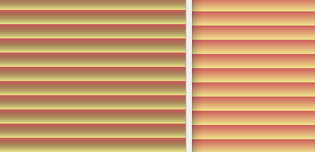
( source )
The meaning of premultiplied color spaces has been clarified (Opera already implements this - see the gradient on the right).
CSSOM
CSSOM is the Document Object Model for CSS . It is an API thats allows you to access style rules, selectors, media queries, and the CSS used to render the styles on a page. This has previously not been specced which meant each browser could implement its own APIs for accessing stylesheets (and they did). Now, we have a comprehensive set of interfaces to access the styles from JavaScript.
We already have parts of CSSOM implemented in various browsers (Opera 11.5+, IE10 , Chrome, FF5 ) though!
Any questions you have that I can ask the Working Group about?